Work
About
Resume
Work
About
Resume
Work
About
Resume
Work
About
Resume


Tezos Homebase
Tezos Homebase
Tezos Homebase
Tezos Homebase
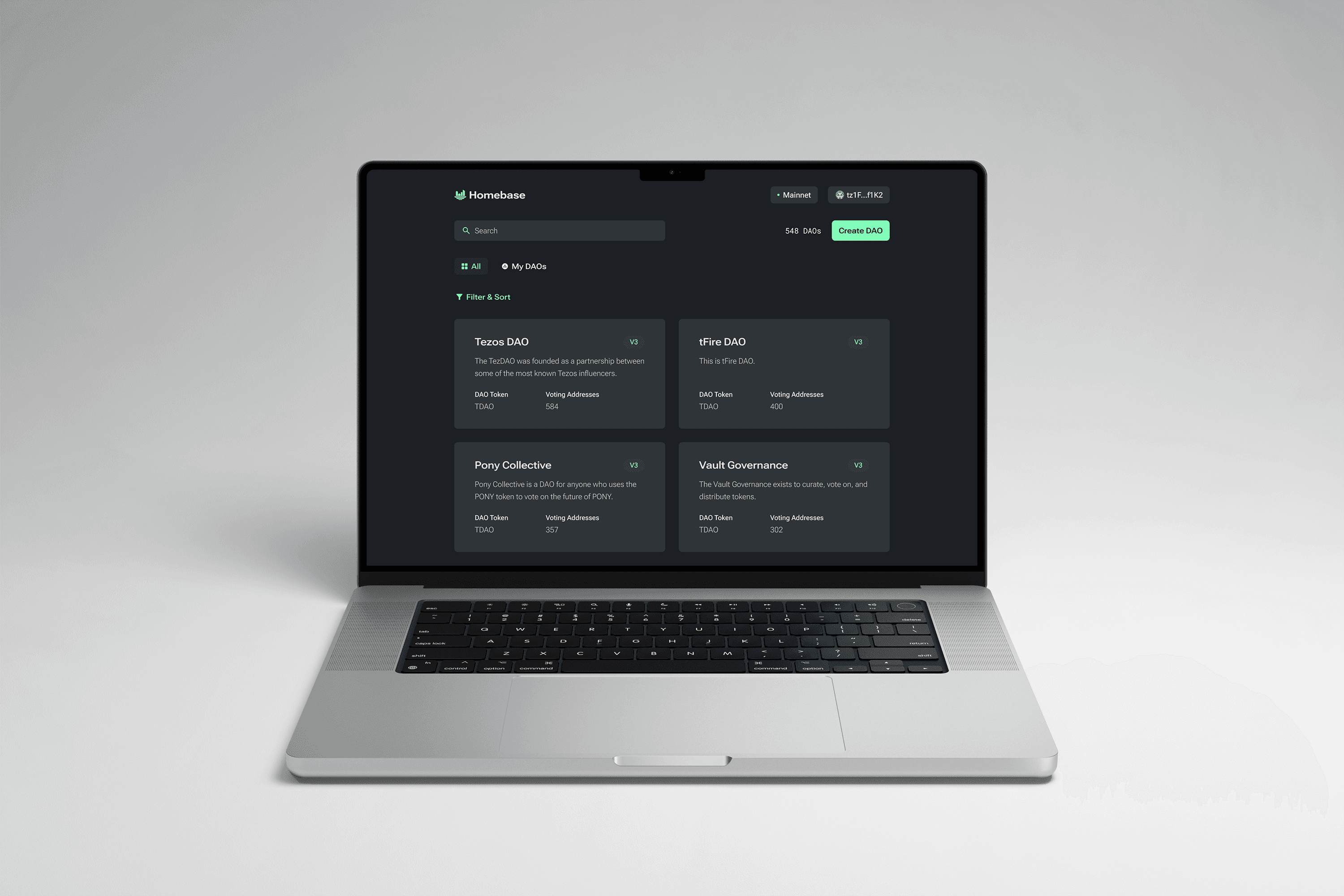
Homebase is the flagship Decentralized Autonomous Organization (DAO) platform for the Tezos blockchain. It allows communities to organize and find consensus through token-weighted voting.
Homebase is the flagship Decentralized Autonomous Organization (DAO) platform for the Tezos blockchain. It allows communities to organize and find consensus through token-weighted voting.
Homebase is the flagship Decentralized Autonomous Organization (DAO) platform for the Tezos blockchain. It allows communities to organize and find consensus through token-weighted voting.
Homebase is the flagship Decentralized Autonomous Organization (DAO) platform for the Tezos blockchain. It allows communities to organize and find consensus through token-weighted voting.
Role
Role
Role
Role
Product Design, Visual Design
Product Design, Visual Design
Product Design, Visual Design
Product Design, Visual Design
Duration
Duration
Duration
Duration
December 2021 – July 2024
December 2021 – July 2024
December 2021 – July 2024
December 2021 – July 2024
The Challenge
The Challenge
The Challenge
The Challenge
Homebase had several usability challenges at the beginning due to its cluttered interface and complex functionalities. Additionally, the client wanted to add more features to Homebase as it grew; the design solution needed to be balanced, intuitive, user-friendly, and adaptable.
Homebase had several usability challenges at the beginning due to its cluttered interface and complex functionalities. Additionally, the client wanted to add more features to Homebase as it grew; the design solution needed to be balanced, intuitive, user-friendly, and adaptable.
Homebase had several usability challenges at the beginning due to its cluttered interface and complex functionalities. Additionally, the client wanted to add more features to Homebase as it grew; the design solution needed to be balanced, intuitive, user-friendly, and adaptable.
Homebase had several usability challenges at the beginning due to its cluttered interface and complex functionalities. Additionally, the client wanted to add more features to Homebase as it grew; the design solution needed to be balanced, intuitive, user-friendly, and adaptable.
Business Goals
Business Goals
Business Goals
Business Goals
Create the leading DAO platform on the Tezos blockchain that is accessible to users of all technical levels, regardless of their experience.
Create the leading DAO platform on the Tezos blockchain that is accessible to users of all technical levels, regardless of their experience.
Create the leading DAO platform on the Tezos blockchain that is accessible to users of all technical levels, regardless of their experience.
Create the leading DAO platform on the Tezos blockchain that is accessible to users of all technical levels, regardless of their experience.
User Goals
User Goals
User Goals
User Goals
Allow communities to collectively manage assets and make informed decisions through a decentralized platform.
Allow communities to collectively manage assets and make informed decisions through a decentralized platform.
Allow communities to collectively manage assets and make informed decisions through a decentralized platform.
Allow communities to collectively manage assets and make informed decisions through a decentralized platform.
Design Process
Design Process
Design Process
Design Process
“How might we turn an inherently complex and technical platform into a clean and user-friendly experience?”
“How might we turn an inherently complex and technical platform into a clean and user-friendly experience?”
“How might we turn an inherently complex and technical platform into a clean and user-friendly experience?”
“How might we turn an inherently complex and technical platform into a clean and user-friendly experience?”
User Research
User Research
User Research
User Research
Through interviews and a dedicated Discord channel, we gathered insights into how users interacted with Homebase. Based on user feedback, we identified three key areas for improvement.
Through interviews and a dedicated Discord channel, we gathered insights into how users interacted with Homebase. Based on user feedback, we identified three key areas for improvement.
Through interviews and a dedicated Discord channel, we gathered insights into how users interacted with Homebase. Based on user feedback, we identified three key areas for improvement.
Through interviews and a dedicated Discord channel, we gathered insights into how users interacted with Homebase. Based on user feedback, we identified three key areas for improvement.
Cluttered and unfocused layout
Issues with feature organization
Inefficient navigation
Cluttered and unfocused layout
Issues with feature organization
Inefficient navigation
Cluttered and unfocused layout
Issues with feature organization
Inefficient navigation
Cluttered and unfocused layout
Issues with feature organization
Inefficient navigation
Layout Optimization
Layout Optimization
Layout Optimization
Layout Optimization
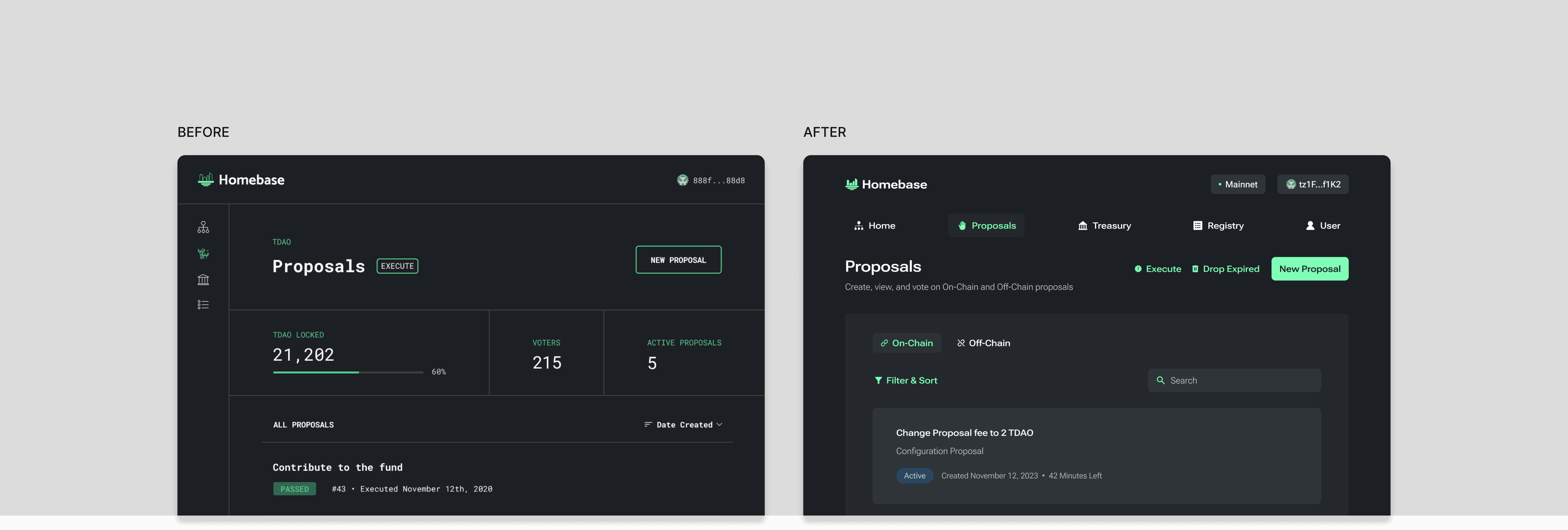
The original table-based layout hindered user comprehension and increased cognitive load because the information was more spread out and difficult to read across the columns. To enhance readability and organization, we replaced tables with cards. Cards provided more breathing room, allowed for better grouping of information, and offered greater flexibility in visual hierarchy through contrasting typography and spacing. This design significantly improved the user experience and made it easier for users to scan content and understand information at a glance.
The original table-based layout hindered user comprehension and increased cognitive load because the information was more spread out and difficult to read across the columns. To enhance readability and organization, we replaced tables with cards. Cards provided more breathing room, allowed for better grouping of information, and offered greater flexibility in visual hierarchy through contrasting typography and spacing. This design significantly improved the user experience and made it easier for users to scan content and understand information at a glance.
The original table-based layout hindered user comprehension and increased cognitive load because the information was more spread out and difficult to read across the columns. To enhance readability and organization, we replaced tables with cards. Cards provided more breathing room, allowed for better grouping of information, and offered greater flexibility in visual hierarchy through contrasting typography and spacing. This design significantly improved the user experience and made it easier for users to scan content and understand information at a glance.
The original table-based layout hindered user comprehension and increased cognitive load because the information was more spread out and difficult to read across the columns. To enhance readability and organization, we replaced tables with cards. Cards provided more breathing room, allowed for better grouping of information, and offered greater flexibility in visual hierarchy through contrasting typography and spacing. This design significantly improved the user experience and made it easier for users to scan content and understand information at a glance.
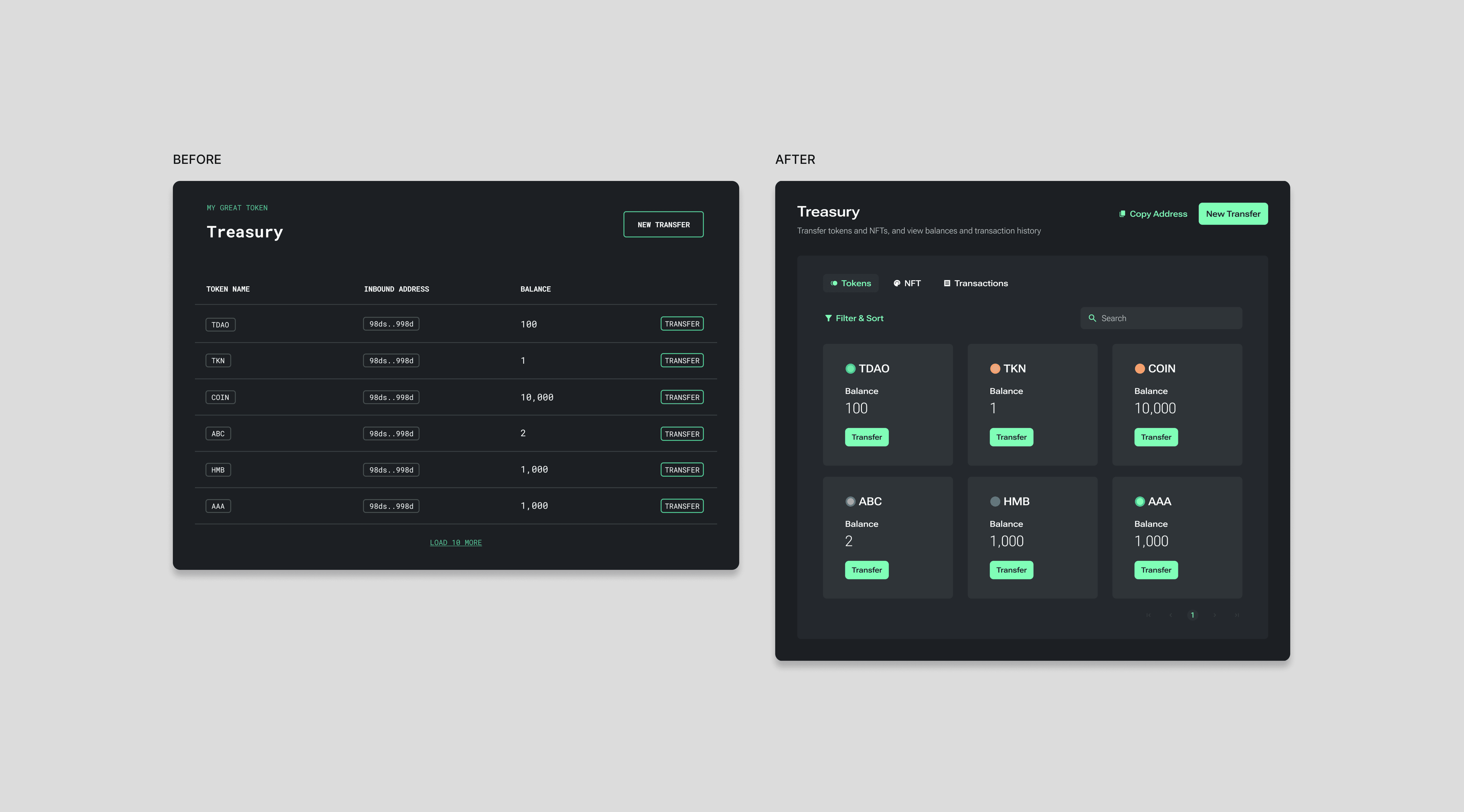


To further improve comprehension, I replaced the original Roboto Mono font with Roboto Flex. Monospace fonts are less suitable for user interfaces due to their reduced readability and increased horizontal space requirements. The transition to Roboto Flex not only improved the overall user experience of Homebase but also aligned with Tezos’ existing branding.
To further improve comprehension, I replaced the original Roboto Mono font with Roboto Flex. Monospace fonts are less suitable for user interfaces due to their reduced readability and increased horizontal space requirements. The transition to Roboto Flex not only improved the overall user experience of Homebase but also aligned with Tezos’ existing branding.
To further improve comprehension, I replaced the original Roboto Mono font with Roboto Flex. Monospace fonts are less suitable for user interfaces due to their reduced readability and increased horizontal space requirements. The transition to Roboto Flex not only improved the overall user experience of Homebase but also aligned with Tezos’ existing branding.
To further improve comprehension, I replaced the original Roboto Mono font with Roboto Flex. Monospace fonts are less suitable for user interfaces due to their reduced readability and increased horizontal space requirements. The transition to Roboto Flex not only improved the overall user experience of Homebase but also aligned with Tezos’ existing branding.


Proposal Option Display
Proposal Option Display
Proposal Option Display
Proposal Option Display
Initially, Homebase presented a limited number of proposal options in a simple button format. As the platform grew, users faced challenges in understanding the available options. To address this, I implemented clickable cards, each providing a clear title and description. Despite its initial improvements, the options lacked a scalable structure to accommodate future growth. To ensure long-term scalability, I divided the cards into well-defined sections based on their categories, preventing the list from becoming overwhelming as new options were introduced.
Initially, Homebase presented a limited number of proposal options in a simple button format. As the platform grew, users faced challenges in understanding the available options. To address this, I implemented clickable cards, each providing a clear title and description. Despite its initial improvements, the options lacked a scalable structure to accommodate future growth. To ensure long-term scalability, I divided the cards into well-defined sections based on their categories, preventing the list from becoming overwhelming as new options were introduced.
Initially, Homebase presented a limited number of proposal options in a simple button format. As the platform grew, users faced challenges in understanding the available options. To address this, I implemented clickable cards, each providing a clear title and description. Despite its initial improvements, the options lacked a scalable structure to accommodate future growth. To ensure long-term scalability, I divided the cards into well-defined sections based on their categories, preventing the list from becoming overwhelming as new options were introduced.
Initially, Homebase presented a limited number of proposal options in a simple button format. As the platform grew, users faced challenges in understanding the available options. To address this, I implemented clickable cards, each providing a clear title and description. Despite its initial improvements, the options lacked a scalable structure to accommodate future growth. To ensure long-term scalability, I divided the cards into well-defined sections based on their categories, preventing the list from becoming overwhelming as new options were introduced.


Navigation Enhancement
Navigation Enhancement
Navigation Enhancement
Navigation Enhancement
The initial side navigation featured icons without accompanying text, which presented challenges for user understanding. To address this, we implemented two main improvements. First, we added clear labels alongside the icons to improve understanding and reduce ambiguity. Second, we switched to a top navigation menu to optimize space, which was particularly effective given the limited number of navigation options. These changes significantly improved navigation efficiency and user comprehension.
The initial side navigation featured icons without accompanying text, which presented challenges for user understanding. To address this, we implemented two main improvements. First, we added clear labels alongside the icons to improve understanding and reduce ambiguity. Second, we switched to a top navigation menu to optimize space, which was particularly effective given the limited number of navigation options. These changes significantly improved navigation efficiency and user comprehension.
The initial side navigation featured icons without accompanying text, which presented challenges for user understanding. To address this, we implemented two main improvements. First, we added clear labels alongside the icons to improve understanding and reduce ambiguity. Second, we switched to a top navigation menu to optimize space, which was particularly effective given the limited number of navigation options. These changes significantly improved navigation efficiency and user comprehension.
The initial side navigation featured icons without accompanying text, which presented challenges for user understanding. To address this, we implemented two main improvements. First, we added clear labels alongside the icons to improve understanding and reduce ambiguity. Second, we switched to a top navigation menu to optimize space, which was particularly effective given the limited number of navigation options. These changes significantly improved navigation efficiency and user comprehension.


Results
Results
Results
Results
The redesigned Homebase platform significantly enhanced user experience and platform usability, leading to a notable increase in user adoption.
The redesigned Homebase platform significantly enhanced user experience and platform usability, leading to a notable increase in user adoption.
The redesigned Homebase platform significantly enhanced user experience and platform usability, leading to a notable increase in user adoption.
The redesigned Homebase platform significantly enhanced user experience and platform usability, leading to a notable increase in user adoption.
Key achievements:
Gained significant user traction with the largest DAO reaching a membership of 5.8k
Increased user understanding of platform features
Enhanced platform navigation and accessibility
Improved overall user satisfaction
Key achievements:
Gained significant user traction with the largest DAO reaching a membership of 5.8k
Increased user understanding of platform features
Enhanced platform navigation and accessibility
Improved overall user satisfaction
Key achievements:
Gained significant user traction with the largest DAO reaching a membership of 5.8k
Increased user understanding of platform features
Enhanced platform navigation and accessibility
Improved overall user satisfaction
Key achievements:
Gained significant user traction with the largest DAO reaching a membership of 5.8k
Increased user understanding of platform features
Enhanced platform navigation and accessibility
Improved overall user satisfaction
Other Work
Other Work
Other Work
Other Work
© 2024, Alana Moon
